
Accessibility in UI

It is important that your website, front end, or user portal be usable by everyone, including those with vision, hearing, cognitive, or motor impairments. The following guidelines will help improve accessibility in the Retirement portal:

Page Structure and Hierarchy
It is important to adhere to a clear and consistent page hierarchy to help users who navigate the page using links or headers. Headings and titles are used to outline the page so that users can see the structure and how the sections relate and can discern where they are in the product.
Usage Guidelines:
Always place items on the page in order of their level of importance. The most important information and actions on a given page should appear at or near the top of the page. Utilize the typographic guidelines outlined in this post. Headings are important in creating consistent and visual language.
Always group like topics and actions together on a page, under headings that clearly communicate the purpose or the content of the group.
It is important to adhere to a clear and consistent page hierarchy to help users who navigate the page using links or headers. Headings and titles are used to outline the page so that users can see the structure and how the sections relate and can discern where they are in the product.
Usage Guidelines:
Always place items on the page in order of their level of importance. The most important information and actions on a given page should appear at or near the top of the page. Utilize the typographic guidelines outlined in this post. Headings are important in creating consistent and visual language.
Copy
Users with visual impairments might use a screen reader, which helps them by reading all page copy and alt-text aloud. The consistent text helps to optimize the site for a screen reader.
Usage Guidelines:
People using screen readers hear every UI element read aloud, so try to keep all user interface text concise.
Be sure to be consistent when labeling elements and components that have the same functionality. When users encounter these elements in different contexts, they should be able to easily recognize and understand the function or actions of an element. For instance, a menu item that is labeled “My Account page” should open a page that is titled “My account page”
Be sure to describe what an element does, when possible. For example “Edit Preferences.”
Use alt-text to describe images and videos so that screen readers can describe these pieces of media.
Focus Indicator
Some users do not use a mouse for navigation. Instead, they use tools like their keyboard or a screen reader. It is important to use a focus indicator so that these users know where they are on a page.
Usage guidelines:
If you can interact with an element with a mouse, you should be able to do so with a keyboard as well. The following are a few things that should be focusable on any website:
Links
Buttons
Form Fields and Controls
Menu Items
Hoverable elements (Tooltips, etc)
The focus should not move to new content without user input.
When the user is inputting information into an interactive field, the focus state should mirror the active state, keeping clear lines as the border. Focus states should appear in the same shape as the object they are surrounding. If solely used around a rounded button, the focus state should not be square.

Colors
We comply with AAA standard contrast ratios. Any color that is used for text across the site adheres to required contrast ratios, and thereby supports usability.

User Goals
Usage Guidelines
Don’t convey information using color alone - use text and other visual cues like iconography or illustrations to help users receive information. For example, an error message combines red color with descriptive text and a caution icon.
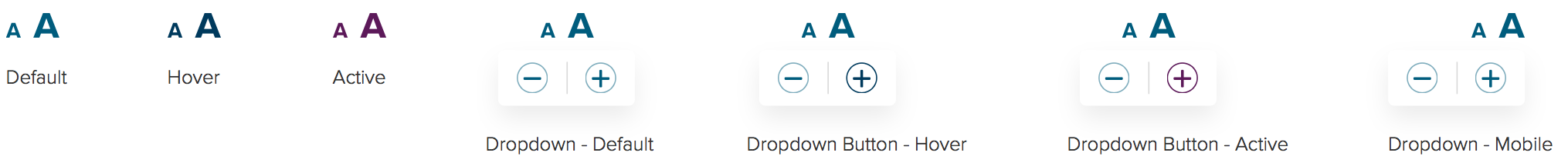
Text Resize Button
All articles should include a text resize button. This offers users the option to adjust text-heavy content for optimal viewing. This should be available in all responsive sizes.
2. Task flow
And now for the I don’t have time to read all of your ramblings - TL;DR
Accessibility in User Interface design - is not only important, it is a must.